You’re ready to paint, but unsure where to start—keep it simple and strategic. Gather a few basic supplies, learn a handful of strokes, and try bold shapes with a small, confident palette. You’ll practice blending, layering, and color mixing without getting overwhelmed. Then move to easy landscapes and floral motifs that suggest form rather than chase detail. When you’re comfortable, a minimalist sunset ties it all together—and that’s where the magic starts.
Key Takeaways
- Gather essentials: a few brush types, beginner-friendly paints (acrylics or watercolors), primed surface, palette, water/solvent, rags, and tape.
- Start with simple subjects: bold abstract shapes, minimal florals, or off-center large shapes with contrasting countershapes.
- Follow step-by-step: block thin base layers, refine shapes, blend wet seams, then add textures and final accents.
- Use limited color palettes: three colors plus white; mix dark into light, test swatches, and neutralize with complements.
- Finish properly: let layers dry, apply thin varnish coats if desired, and display away from harsh light and humidity.
Essential Supplies: Brushes, Paints, Canvases, and Paper
Before you put brush to canvas, gather four basics: brushes, paints, surfaces, and paper.
Choose a few brush types: a flat for bold shapes, a round for lines and details, and a filbert for soft edges. Add a small liner for signatures.
Choose a flat for bold shapes, a round for details, a filbert for soft edges—plus a liner for signatures.
Pick paints that suit your pace—acrylics dry fast, oils stay workable, watercolors lift easily. Test paint textures; smooth paints glide, heavier bodies hold peaks.
Select canvases or panels primed for your medium. Stretched canvas is light and ready; panels give a firm feel.
For practice and studies, use paper matched to your paint: heavyweight watercolor paper for washes, acrylic paper for quick sessions, oil paper for solvent-free starts.
Keep a palette, water or solvent, rags, and tape handy.
Basic Techniques: Strokes, Blending, and Layering
Even with simple tools, your painting comes alive through how you move paint: strokes, blending, and layering.
Begin with brush techniques: hold the handle near the ferrule for control, farther back for loose marks. Practice straight, curved, and zigzag strokes. Vary pressure to switch from thin lines to bold swaths. Load your brush evenly, then lift cleanly to avoid frayed edges.
For blending, work while paint is wet. Place two adjacent strokes, then sweep a clean, slightly damp brush across the seam in short passes. Feather edges with light, overlapping taps. If paint dries, soften with a tiny amount of medium instead of scrubbing.
Use layering methods to build depth. Let each layer dry. Start thin, establish shapes, then add textures and sharper accents last.
Color Confidence: Mixing, Harmonies, and Simple Palettes
Your brushwork sets the stage; now color does the storytelling. Start with basic color theory: learn primaries, secondaries, and neutrals. Use a color wheel to spot relationships—complementary for contrast, analogous for calm, triadic for balance.
Mix slowly: add dark to light, and test swatches as you go. Adjust color brightness with white for tints, black for shades, and complements for subtle grays.
Mix slowly—dark into light—swatch often. Tint with white, shade with black, neutralize with complements.
Build simple palettes. Try three colors plus white to keep mixes clean and cohesive. Note color moods: warm hues feel inviting, cool hues feel quiet. Pre-mix a light, mid, and dark of each hue to speed decisions.
Keep a mixing chart to repeat results. If a mix turns muddy, pause, wipe the palette, and reset with fresh, deliberate mixtures.
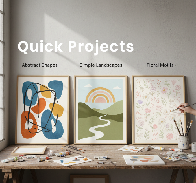
Quick Projects: Abstract Shapes, Simple Landscapes, and Floral Motifs

Start with bold abstract shapes: block in three large forms, test high-contrast colors, and adjust edges for balance.
Then try minimal floral studies: sketch a single stem, limit yourself to two hues, and suggest petals with a few confident strokes.
You’ll build speed, control, and a clear eye for composition.
Bold Abstract Shapes
Although color and composition can feel intimidating at first, bold abstract shapes let you plunge in quickly and learn by doing. Start with a limited palette and large brushes. Block in circles, triangles, and sweeping bands, aiming for bold color contrasts that energize the page.
Keep edges clean or intentionally rough—both choices add structure. Step back often to evaluate balance and rhythm.
- 1) Paint a large dominant shape off-center, then add two smaller countershapes to create dynamic shape compositions.
- 2) Layer translucent washes over opaque forms to vary weight, depth, and temperature.
- 3) Introduce a single accent line or bar to guide the eye and unify the layout.
Rotate the canvas, simplify overlaps, and crop with tape. You’ll develop confidence fast by editing decisively.
Minimal Floral Studies
Even with just a few brushstrokes, minimal floral studies teach you to suggest petals, stems, and leaves without overworking them.
Begin by choosing two or three floral color schemes—one light, one mid, one dark—to create depth fast. Sketch a loose oval for the bloom. Load a round brush, press, lift, and pivot to form each petal; these petal techniques give crisp edges and soft centers in one motion. Leave white gaps for air.
Add a single stem with a swift downward stroke, then two leaf shapes using the same press-and-lift move.
Work from largest shapes to smallest accents. Limit details to a center dot, a shadow wash, and one highlight.
Paint three variations, changing color temperature and spacing. Stop early; let suggestion carry the form.
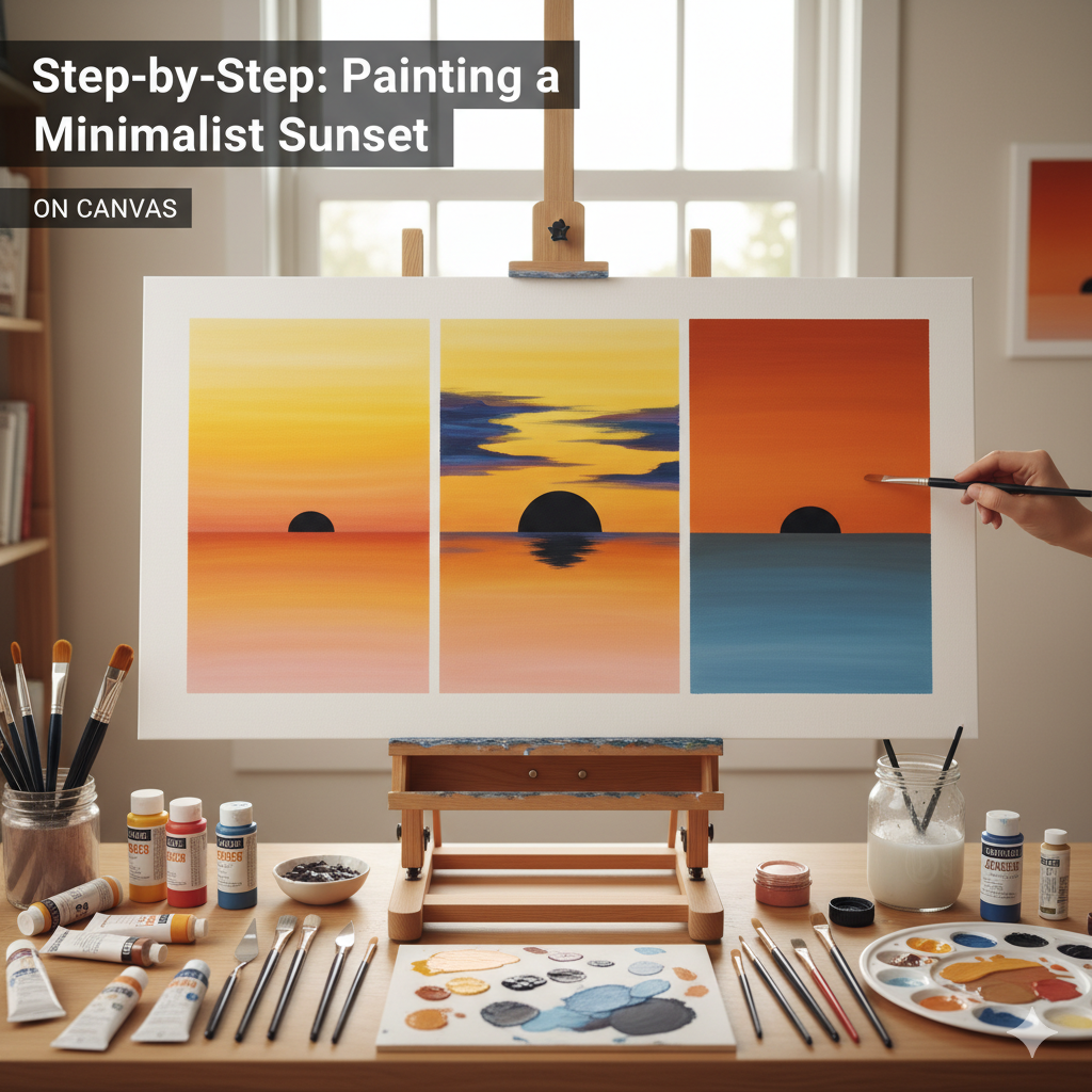
Step-by-Step: Painting a Minimalist Sunset on Canvas

Start by choosing a simple palette—think three to four hues like warm yellow, soft peach, muted orange, and a deep plum or navy.
Arrange your colors from light to dark on your palette so you can blend smooth gradients from horizon to sky.
Work in thin layers, overlap edges with a clean, slightly damp brush, and keep your strokes horizontal for a calm, minimalist finish.
Choosing a Simple Palette
A limited palette makes your minimalist sunset cohesive, calm, and easy to paint. Use color theory to guide your palette selection: choose hues that relate and mix cleanly. For a simple sunset, pick one warm, one cool, and one neutral to control mood and contrast without clutter.
- 1) Warm base: Cadmium Yellow Medium or Yellow Ochre sets the glow near the horizon.
- 2) Accent warmth: Alizarin Crimson or Cadmium Red Light shapes the upper sky and adds depth.
- 3) Cooling counterpoint: Ultramarine Blue tempers warmth and creates subtle dusk notes.
Add Titanium White to adjust value, and a touch of Payne’s Gray if you need deeper shadows.
Squeeze small amounts, test mixes on scrap, and note ratios. You’ll stay focused, waste less paint, and keep your sunset harmonious.
Blending Smooth Gradients
With your limited palette set, you’ll blend a smooth sky from horizon glow to cooler upper tones. Load a soft flat brush with your warm hue and lay a thin band along the horizon.
Without washing, pick up the mid-tone and overlap the edge, using light horizontal strokes. Keep strokes long and consistent to practice clean gradient techniques.
Wipe the brush, then add your coolest color at the top. Feather downward into the mid-tone, working wet-into-wet for seamless color blending. If bands appear, mist the surface lightly or add a touch of glazing medium.
Switch to a clean, dry brush. Gently sweep across shifts to unify them. Step back, assess edges, and adjust with thin glazes.
Let layers set before deepening values near the horizon.
Finishing Touches: Drying, Sealing, and Display Tips
Though the painting’s done, the finish determines how professional it looks and how long it lasts. Start with smart drying techniques: lay the piece flat on a dust-free surface, avoid direct sun, and let layers cure fully—acrylics need hours, oils may need weeks.
Keep pets, fans, and lint away. Next, choose sealing options that match your medium and sheen: matte for soft, satin for balanced, gloss for vibrancy. Apply thin, even coats; let each coat dry per label.
Keep dust away, pick the right sheen, and seal in thin, even coats with proper dry time.
Now display thoughtfully. Hang out of harsh light, control humidity, and use spacers or frames to protect edges.
- Test varnish on a scrap to confirm clarity and sheen.
- Photograph the artwork before sealing to avoid glare.
- Label, date, and store flat with acid-free materials.
Conclusion
You’ve got the tools, the techniques, and a handful of simple projects to get started. Choose a limited palette, practice confident strokes, and layer with intention. Begin with bold abstracts, try a tiny landscape, then suggest florals with minimal marks. For your sunset, follow the steps, keep edges soft, and let colors blend. Let pieces dry fully, seal thoughtfully, and display proudly. Show up often, learn from every brushstroke, and trust your eye. You’re ready—paint with joy.

